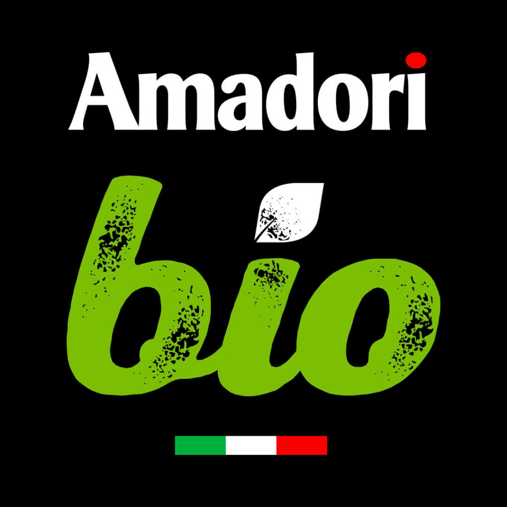
As one of Amadori’s partners in the rebranding journey, Menabò renews the graphic design with its take on the brand’s organic line, working on a distinctive look and feel that matches the company’s new brand identity.
While keeping in mind the characteristic visual elements of the packaging system, to maximise shelf visibility the word “bio” has been emphasised with a lettering that draws the eye set against the white background of the label, just below the Amadori logo.

The chosen lettering, with its soft lines, green color, and a leaf as the dot on the “i,” immediately evokes the naturalness of the products, whose benefits are clearly highlighted in the communication area below, with a green background to facilitate an informed purchasing decision.
