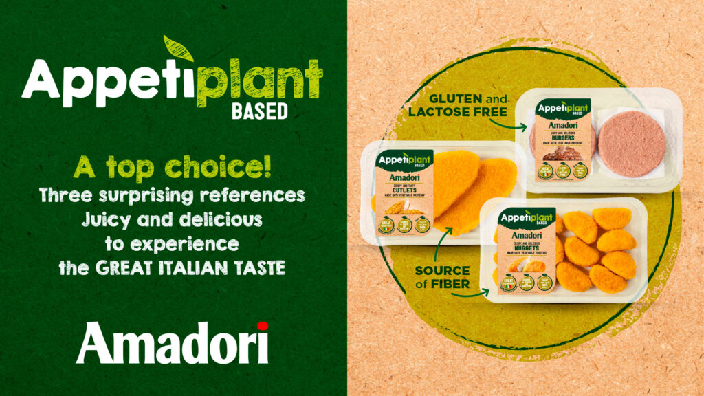
Amadori differentiates its export offer with a major innovation, choosing Menabò to create a name and visual identity for its plant-based and meat-analogue product line – a range based on vegetable proteins without giving up on taste and texture typical of meat.
To highlight the very alternative nature of the new line compared to the company’s core offering and to make it stand out among competitors, a name was created that could have the distinctive strength and evocative power of a brand.

The neologism “Appetiplant” immediately conveys the promise of these satisfying products, while also positioning them as plant-based, appealing to those who enjoy exploring meat alternatives without sacrificing taste.
The product name also has a gentle, reassuring sound, with phonetics that play on alliterations, enhancing its memorability.

The all-natural goodness of the line is central to the graphic development. The sub-brand is characterised by thin lines and a leaf-shaped accent, while the label features two rounded colour areas – green and straw-colored – that recall the plant world and imperfect lines, giving it a more artisanal look.
Menabò managed all-launch related activities, which included the handling of all communication materials for trade and point-of-purchase.


